
Your website is not a brochure. It is the first clinical impression your practice makes on a prospective patient who has never met you, never spoken to your staff, and has no reason yet to trust you with something as personal as his hormonal health. In that context, a slow load time, a generic stock photo, or a confusing navigation structure is not an aesthetic problem. It is a trust problem.
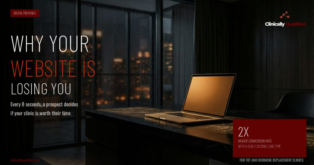
The average person forms a first impression of a website in 0.05 seconds. By the time a man has spent eight seconds on your homepage, he has already decided whether your clinic feels like a place that understands him or a place that looks like every other medical website he has seen. Most hormone clinic websites fail that test.
The Five Things Men Are Evaluating Immediately
The first is speed. A website that takes more than two seconds to load loses a measurable percentage of visitors before they ever see a single word of your copy. In a world where every other digital experience is instant, a slow website signals that your clinic is behind — and if you are behind on your website, the prospect reasonably wonders what else you are behind on.
The second is specificity. Generic hormone clinic websites use generic language: "We help you feel your best," "Personalized care for every patient," "Your health is our priority." These phrases mean nothing because every clinic says them. The men who are most valuable to your practice — the ones who have done their research, who understand what they need, and who are ready to invest — are not moved by generic language. They are looking for a clinic that speaks their specific language and demonstrates that it understands their specific situation.
The fourth is clarity of next step. Many hormone clinic websites bury the call to action or make it unclear what the prospect is supposed to do. "Contact us" is not a compelling call to action. "Book your free consultation" is better. "See if you qualify — book a 15-minute call" is better still. The easier and more specific you make the next step, the more people take it.
The fifth is mobile experience. The majority of your traffic is coming from a phone. A website that is not optimized for mobile is not just an inconvenience — it is a direct revenue leak. If a man has to pinch and zoom to read your content or the booking button is hard to tap, he is gone.
The Authority Gap
Beyond the functional issues, there is a deeper problem with most hormone clinic websites: they do not establish authority. They describe services. They list credentials. They include a contact form. But they do not demonstrate that the clinic understands the patient's world, has a point of view on his situation, and has helped men like him achieve specific outcomes.
Authority is built through content, specificity, and design. A clinic whose website includes detailed educational content about hormone optimization, whose design signals premium positioning, and whose copy speaks directly to the experience of the men it serves will convert at a meaningfully higher rate than a clinic whose website is a digital business card.
The man who is considering hormone optimization has usually done significant research before he contacts a clinic. He has read articles, watched videos, and formed opinions. When he lands on your website, he is not evaluating whether hormone therapy is right for him. He is evaluating whether your clinic is the right place to do it. Your website needs to answer that question convincingly.
What a High-Converting Hormone Clinic Website Actually Looks Like
It loads in under two seconds. It has a clear, specific headline that speaks to the outcome the patient wants, not the service the clinic provides. It has social proof above the fold. It has a single, clear call to action that is easy to find and easy to take. It has educational content that demonstrates expertise. It has a design that signals premium positioning. And it is fully optimized for mobile.
Your website is either working for you or against you. There is no neutral.
It would be dishonest to write a post about marketing momentum without addressing the part that feels terrible before it feels good.